At two recent SAB meetings the idea of evolving the Club Crest has been discussed at length. I have had to wait until the club launched its consultation to the wider fanbase before discussing further. The club has done this early today, with the link below taking you to the relevant article on the club website:
[You must be registered and logged in to see this link.]
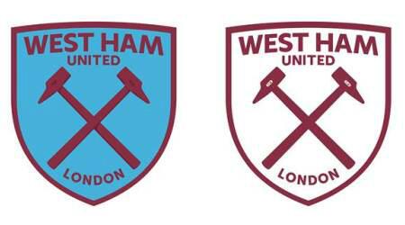
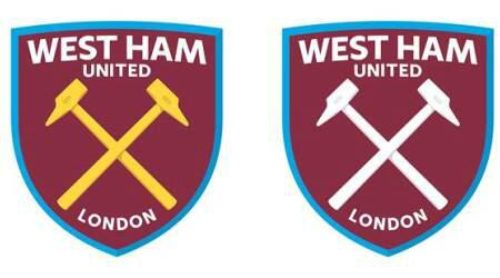
The club has gone into exhaustive research in attempting to recognise our heritage in the suggested designs that were shown to us (these were just suggestions as the club sought feedback from the SAB before then consulting the wider fanbase on their views). I was surprised by how often the crest has actually changed over the years. The Boleyn castle didn't appear on our crest until the '60s and was removed in the early-to-mid-80s before being restored. There was discussion about removing the castle so as to make the crossed hammers stand out more. The hammers have always been part of the club badge as they were key tools used by the Thames Ironworks, upon which the club was founded by Arnold Hills back in 1895. In the modern day we see the players, management and chairmen making the 'crossed hammers' sign whereas the castle is represented mainly by the ghastly turrets outside the West Stand. The hammers do not stand out enough and this is a drawback on modern facets such as social media.
There was a discussion as to how the club name should be incorporated into the badge and whether 'West Ham' should be bigger than the 'United'.
There was also a discussion on the merits or otherwise of adding 'London' to the badge - not as a name change but to make our location clear worldwide. This could be a moneyspinning marketing tool for the club and apparently other London clubs have tried to trademark the use of 'London' themselves in recent years.
The general feeling was also that the scroll be removed and that the crest would just involve the 'shield' which currently contains the castle and hammers.
Here is the full personal feedback I emailed to the club following the follow-up to the AGM, which I am leaving here to hopefully begin discussion and debate here:
Before I go into my personal feedback and feelings on the evolution of the club crest, I thought I should correct a historical error. The Club's last crest change was actually 1999, not 1997 as presented this week and reported this evening on the official website. The previous incarnation of the crest was evident on the Pony-manufactured kit in 1998/99, with the current crest making its first appearance with the introduction of Fila as the club's kit manufacturer for 1999/2000 when the 'F.C.' was removed from the club crest too. [you can see this error has been corrected and that 1999 has been used in the link above].
Onto my personal thoughts regarding the evolution of the crest: firstly, I am in support of an evolution and really recognise and appreciate the huge amount of work, effort and consideration that has clearly gone into understanding and portraying the club's full history in the prospected new designs - I feel this work has to be represented in some way to the wider fanbase so that a negative reaction to a potentially controversial move can be averted.
I am in favour of removing the castle and would also remove the gold too, making the crossed hammers sky blue. I would personally think 'the simpler, the better' and just sky blue crossed hammers on a claret background within the shield would be fine.
If the club name was to be added to the crest, I would not be in favour of making the 'West Ham' bigger than the 'United'. The club is 'West Ham United' and, from previous conversations with older fans, this is how the club always used to be referred to (Bobby Moore himself, apparently, would religiously call the club 'West Ham United' when interviewed). I really don't like it when David Gold refers to us as 'West Ham Football Club' - it's 'West Ham United'!
I was relatively vocal on Tuesday in my lack of support for the addition of 'London'. I think the addition of London makes it sound like we have to tell the world where we're from, as if we're the little brother of Arsenal, Tottenham and Chelsea jumping around seeking attention. We shouldn't have to do that and I think playing in the stadium which hosted the London Olympics will do that for us anyway. I can see and respect the alternative view though and my opinion did soften when Angus [Kinnear, Managing Director] explained it in depth but I still think I'd lean on the side of not having it.
I am also happy to have the scroll bearing the club name removed. If 'London' was to be removed from the shield and the club name was to be incorporated, then I would prefer the name to be along the bottom within the shield, rather than at the top. With my Media background, I believe it is better to have the club name at the bottom, anchoring the image of the crossed hammers, rather than having the name as the first thing your eyes are naturally drawn to at the top.


 not f***** happy , change f*** all , i would need to get a new tattoo and i've only had this one for a few months and its not even fully coloured in yet